Buttons
Buttons are affordances that communicate to the user which actions can be taken. In the Leviy platform a collection of buttons are used that support different user cases.
Button Variants
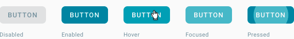
Contained Buttons
Contained buttons have a more prominent appearance due to their fill. They highlight the most important primary actions. Using more than once primary button in the same component/ page should be avoided.
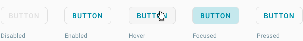
Outlined Buttons
Outlined buttons have a more prominent appearance than text buttons and a more subtle appearance as opposed to contained buttons. They can be used for secondary actions or where actions are of same importance.
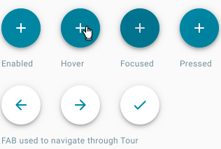
Floating Action Buttons
A floating action button represents the most common action(s) on a page. In the mobile app the floating action button serves as a speed dial. In the webapplication it is commonly used as an add button.
Implementation
.btn-danger, .btn-warning, .btn-info, .btn-success, .btn-dark, .btn-light.
Normal buttons
For primary actions, we use the buttons with a 'primary' class. For secondary actions (like a cancel button) we use the 'outline-primary' class.
{% import '@leviy-templates/macros/buttons.html.twig' as buttons %}

{{ buttons.button('Primary', 'primary', 'submit') }}
{{ buttons.button('Primary Outlined', 'outline-primary', 'submit') }}
Floating action button
We only use one color variant for the Floating action button. The tour has its own floating action button.
{% import '@leviy-templates/macros/buttons.html.twig' as buttons %}

{{ buttons.floating_action_button('add', 'primary') }}
Other variants
When using the button macro, there are some options that can be added.
Check the macro in templates/macros/buttons.html.twig for more information.
Icon buttons
{% import '@leviy-templates/macros/buttons.html.twig' as buttons %}

{{ buttons.icon('people', 'Button title', 'extra-class', 'https://leviy.com', false, { 'test': 'test' }, 'id') }}
{{ buttons.icon('people', 'Button title', 'extra-class', 'https://leviy.com', true, { 'test': 'test' }, 'id') }}
Button type attribute
{% import '@leviy-templates/macros/buttons.html.twig' as buttons %}

{{ buttons.button('Button', 'primary', 'button') }}
{{ buttons.button('Submit', 'primary', 'submit') }}
{{ buttons.button('Reset', 'primary', 'reset') }}
Disabled state
{% import '@leviy-templates/macros/buttons.html.twig' as buttons %}

{{ buttons.button('Primary disabled', 'primary', 'submit', true) }}
{{ buttons.button('Outlined disabled', 'outline-primary', 'submit', true) }}
Data attributes (inspect element to see data-* attributes)
{% import '@leviy-templates/macros/buttons.html.twig' as buttons %}

{{ buttons.button('Button', 'primary', 'submit', false, { 'test': 'test' }) }}
{{ buttons.link('Link', 'primary', 'https://leviy.com', false, { 'test': 'test' }) }}
{{ buttons.floating_action_button('add', 'primary', '', 'https://leviy.com', false, { 'test': 'test' }) }}
Anchor target attribute
{% import '@leviy-templates/macros/buttons.html.twig' as buttons %}

{{ buttons.link('Opens in a new tab!', 'primary', 'https://leviy.com', false, { 'test': 'test' }, '_blank') }}
Anchor with Button styling
Since we do not use the
.btn-link CSS class in our codebase, it is advised to not use this styling on a Button element.
However, since a button does not necessarily have a URL attribute, it is OK to use the buttons.link() macro, so that an anchor with a path/url can look like a button.
{% import '@leviy-templates/macros/buttons.html.twig' as buttons %}

{{ buttons.link('Now it looks like a button!', 'primary', 'https://leviy.com') }}